- JumpCloud Community
- JumpCloud
- Product News
- Introducing the new Device Full Page Experience
- Subscribe to RSS Feed
- Mark Topic as New
- Mark Topic as Read
- Float this Topic for Current User
- Bookmark
- Subscribe
- Mute
- Printer Friendly Page
Introducing the new Device Full Page Experience
- Mark as New
- Bookmark
- Subscribe
- Mute
- Subscribe to RSS Feed
- Permalink
- Report Inappropriate Content
03-27-2024 02:03 PM
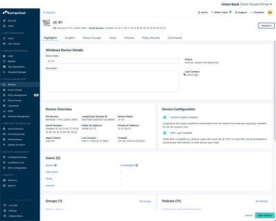
Yesterday we released the redesign of one of the most important pages in the JumpCloud Admin Portal: the Device Page. Admins who use JumpCloud to manage their device fleets will now be greeted by a new full-page view that brings experience enhancements and new features to your fingerprints to help get the job done.
Some highlights:
- Responsive design to work on the various devices admins use to access the Admin Portal. With this migration to new design, screens both large and small will benefit from improved real estate utilization.
-
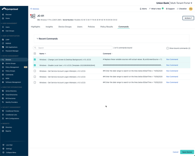
Commands are now part of the Device Page! Previously, the only way to see what Commands were bound to a device was going between each Command individually and seeing if it was bound to a device or device group. Now, Commands can be bound, unbound and run all on the Device page, with a quick-view of results available on the same screen.
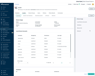
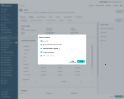
- System Insights was given a facelift! Navigating between the various sections of your Insights is easier with more data showing by default and less load time. Additionally, exporting the Insights for a device can be done in a matter of a few clicks.
We are very excited for this change to be in the hands of our admins. To learn more about what changes were made and to see a side-by-side comparison of old and new, check out this helpful article!
- Labels:
-
Administrative Console
-
Product News
- Mark as New
- Bookmark
- Subscribe
- Mute
- Subscribe to RSS Feed
- Permalink
- Report Inappropriate Content
03-27-2024 06:52 PM
(This was tested on both a 1920x1080 24 inch monitor and a 13 inch laptop with default size settings set to 100% in Chrome)
Hello,
While we appreciate you trying to constantly update the overall JumpCloud experience but we need to point out this release has a large amount of formatting issues to the point where we can't even use it for our needs properly anymore without wasting a lot time as the new full screen mode requires a lot more interaction and doesn't display all information correctly.
1. The margins/padding are not properly optimized/applied with the Cancel and Save device banner taking up a large portion of the page and if you go to the insight tab for example actually covers up information like the IP and Hostname partially.
2. The overall font and spacing size is way too big requiring a large amount of extra interaction though scrolling to see all of the information. It is now not something you can easily look at with a glance and there is no way to condense the shown information for most things. This is especially noticeable on the HIGHLIGHTS page where you can't see the main highlights(device overview) AT ALL without scrolling down.
3. The rows per page is not a setting that keeps your previously used amount and requires the user to click to another page or to adjust the rows now EVERY time for almost everything. This is a large amount of extra interaction vs before for the same results.
4. The Device Groups page adds "....." to longer device group names and hovering over it does not display what it is and there is no way to adjust the displayable area. We have personally have multiple device groups that start with the same beginning description and we can no longer differentiate between them without clicking into each one.
5. Under insights Operating systems the margins do not properly adjust for smaller screens when viewing a windows device and the Cancel/Save Device banner covers information. When viewing a mac os device it covers the Rows tab in the same area making some information inaccessible.
I'm sure there is more but this is what we have immediately noticed. This is making doing our job with multiple devices much harder than it was before due to all the optimization and formatting issues. Some suggestions are as follows;
1. Change the banner for save device/cancel just to the bottom right of the screen instead of taking up the whole bottom or make it that there is padding for everything displayed so no overlaps occur. This will allow information to display properly, and if the banner is reduced either to the corner or overall, increase the immediate viewable area.
2. The Highlights page needs to be reformatted so you can see the majority of the information immediately displayed without scrolling. This is literally the function of a highlight page and needs to be focused on since it is the first thing you see.
3. Have a memory for "rows" so that it does not change to 10 every single time you open a new tab or device or reenable to the ability to constantly scroll with it auto adjusting the row amount.
4. For device groups allow the display area to be resized for the name or have it so that when you hover over it that it displays the whole name. This will keep you from having to enter a whole separate page to simply make sure you have longer group names properly checked.
5. Please make the full screen OPTIONAL due to these current issues and for the people who like to quickly go back to where they were working on the previous page and click into other areas/devices without having to exit a whole full screen mode. I believe that both types of viewing have their merit but that the "old" condensed view should be the default as it is less intrusive with the option to enter into full screen mode for a better viewing experience.
Overall the full screen mode has a lot of formatting issues and requires a lot more interaction to see the information you need. I would very much appreciate these fixes being applied to this and having an update like this be optional until fixes are applied and Q&A testing is done in the future. Thank you
PS. I am sending this at the end of the work day so I may not respond to inquires for a while.
- Mark as New
- Bookmark
- Subscribe
- Mute
- Subscribe to RSS Feed
- Permalink
- Report Inappropriate Content
03-29-2024 11:20 AM
Hi Sam!
I've taken these requests to our design for analysis. As usual, I highly recommend working with our support team to surface issues you may encounter and they can get us the specifics needed to get them addressed quickly and transparently.
Also, the Submit an Idea button in the Admin Portal under Support is a great way to submit feedback and have it land directly on our product team laps. Either way, I appreciate you taking the time to type all of that up at the end of your day and look forward to hearing more.
- Mark as New
- Bookmark
- Subscribe
- Mute
- Subscribe to RSS Feed
- Permalink
- Report Inappropriate Content
03-28-2024 05:39 AM
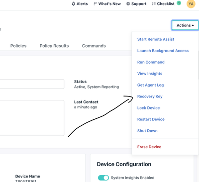
It may also be useful to remind. If you are using bitlocker or file fault, here is the recovery key screen.
New to the site? Take a look at these additional resources:
Ready to join us? You can register here.
